In this tutorial we will show you how to call and plot responses from the StreamCardano API using recharts and KY. We will also be tracking any errors which occur during the events using sentry.io so that we can take action on broken lines of code, crashes and busted API calls.
Preliminaries #
Firstly, create a React app with a typescript template from scratch using create-react-app(CRA) in the directory, this will scaffold a basic typescript ReactJS project for us:
npx create-react-app streamcardano --template typescript
Let’s setup the environment variables so our Typescript code does not hold our configuration and secrets, make sure to name your environment variables starting with REACT_APP naming convention otherwise your React application will not pick them:
REACT_APP_STREAMCARDANO_HOST=beta.streamcardano.dev
REACT_APP_STREAMCARDANO_KEY=YOUR_API_KEY_HERE
REACT_APP_SENTRY_DSN=YOUR_DSN_HERE
Next, change into your project directory and run your application and view it on your browser at localhost:3000
cd streamcardano
npm start
Then let’s install the important packages that will help us use StreamCardano API, plot responses and report any errors or crashes:
npm i ky @microsoft/fetch-event-source @sentry/react @sentry/tracing recharts
Setting Up Sentry.io #
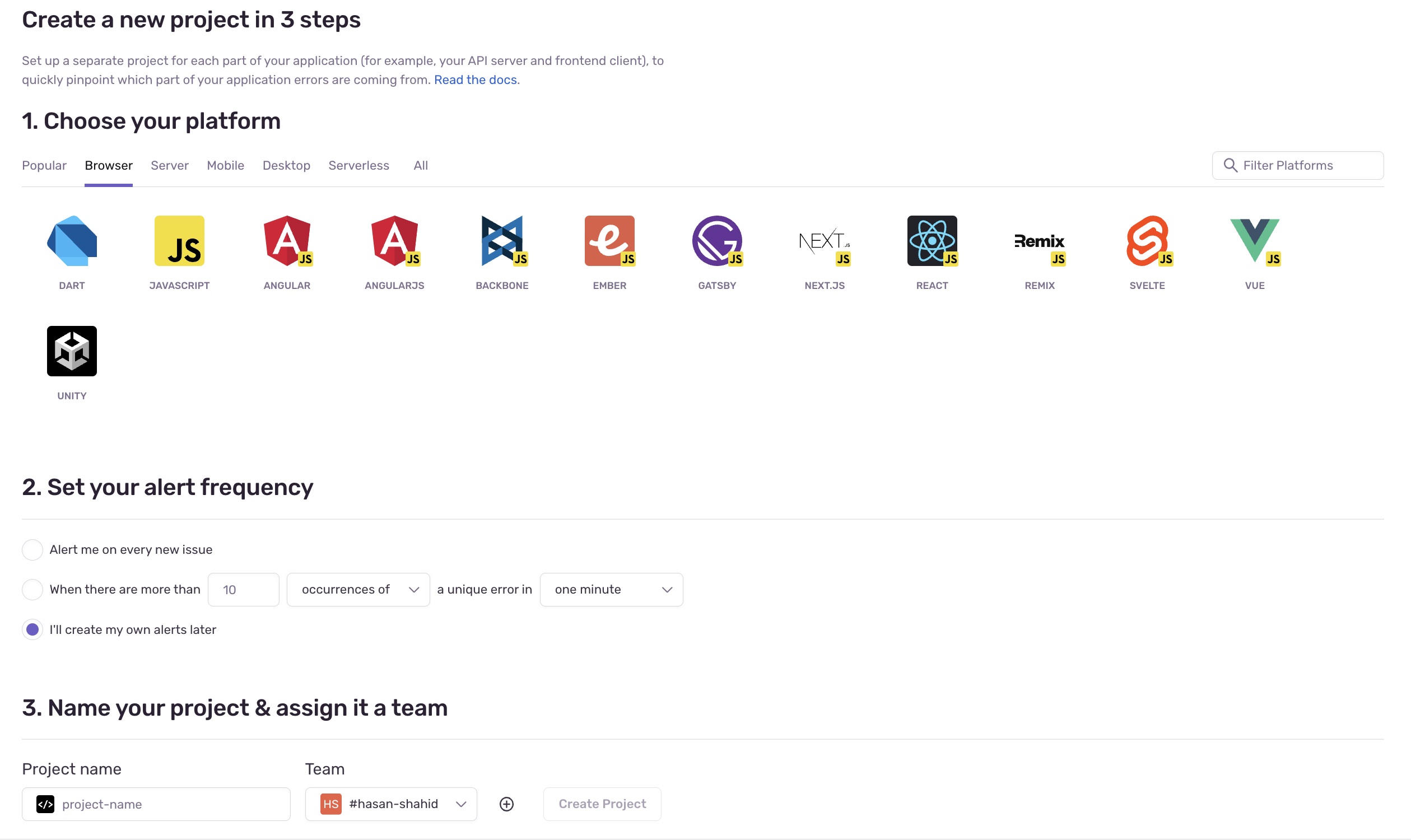
Sign up at sentry.io and create a new project. After you’ve successfully created an account you can create a new project and select the platform you want to use sentry with.
After creating the project, you’ll be taken to a guide to configure your reactJS project with sentry. Let’s do it. Add these line of codes to index.tsx under src directory.
Sentry.init({
  dsn: process.env.REACT_APP_SENTRY_DSN,
  integrations: [new BrowserTracing()],

  // Set tracesSampleRate to 1.0 to capture 100%
  // of transactions for performance monitoring.
  // We recommend adjusting this value in production
  tracesSampleRate: 1.0,
});
and then index.js is going to look something like this.
import React from "react";
import ReactDOM from "react-dom/client";
import * as Sentry from "@sentry/react";
import { BrowserTracing } from "@sentry/tracing";
import "./index.css";
import App from "./App";

<<sentry-config>>

const root = ReactDOM.createRoot(
  document.getElementById("root") as HTMLElement
);
root.render(
  <React.StrictMode>
    <App />
  </React.StrictMode>
);
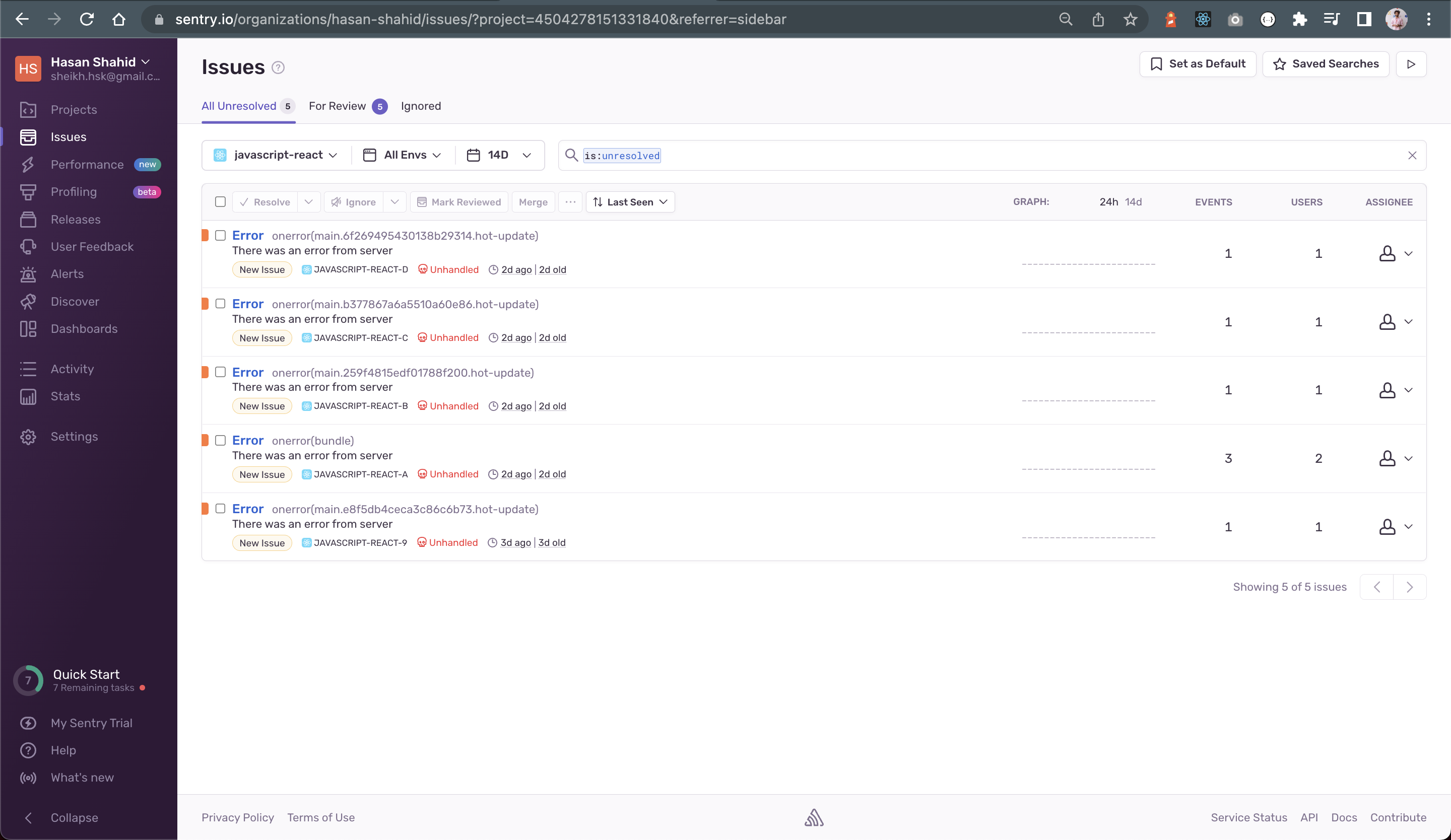
Once this configuration is done we can throw errors in our built application and sentry is going to beautifully list them down for us in the dashboard
Setting Up KY #
Under the src directory of your project, make another directory called config and over there let’s configure our KY configurations:
import ky, { KyResponse, Options } from "ky";

/**
 *
 * @param request
 * @param options Options are the same as window.fetch, with some exceptions.
 * @param response
 * @returns the body of the response as a new Fetch API interfaced response
 */
const transformResponse = (
  request: Request,
  options: Options,
  response: KyResponse
) => {
  return new Response(response.body);
};

// modifying our ky instance configuration
export const kyInstance = ky
  .create({ prefixUrl: process.env.REACT_APP_STREAMCARDANO_HOST })
  .extend({
    /**
     * here we have tweaked the response to the request
     * using one of the hooks provided by ky to transform our response
     * this is done over here for code reusability so that we don't have
     * to do the same configuration with every request
     */
    hooks: {
      afterResponse: [transformResponse],
    },
  });
Custom Chart Components #
It is a good practise to wrap a library that is being used in your web application as your own custom component. It helps us to maximize code reuse and consistency. Also let’s say if you were to update any packages and one of them has major changes. But if you those components wrapped with your custom components, you just need to make changes only in your wrapper component.
Let’s start with making our custom chart components.
Custom Line Chart #
Defining interfaces for our custom component
/**
 * @typedef CustomLineChart
 * @property {Array<object>} data          Data that is to be plotted
 * @property {number}        chartHeight   Height of the chart
 * @property {number}        chartWidth    Height of the chart
 * @property {Array<string>} lines         The key for the lines to be plotted inside data
 * @property {object}        xLabel        Props for x-axis label
 * @property {object}        yLabel        Props for y-axis label
 * @property {string}        xLabelKey     Key for x-axis
 * @property {string}        yLabelKey     Key for y-axis
 */

/** @type {CustomLineChart} */
export interface ICustomLineChart {
  data: Array<object>;
  chartHeight: number;
  chartWidth: number;
  lines: Array<object>;
  xLabel: object;
  yLabel: object;
  xLabelKey: string;
  yLabelKey: string;
}
and for the IMargin interface we will add another interface in CustomLineChart.interface.ts.
export interface ILineMargin {
  top?: number;
  right?: number;
  bottom?: number;
  left?: number;
}
For styling our custom line chart
import React from "react";
import { ILineMargin } from "./CustomLineChart.interface";

const Container: React.CSSProperties = {
  backgroundColor: "white",
  padding: 30,
};

const Margin: ILineMargin = { right: 20, left: 20, bottom: 20 };

export const styles = {
  Container,
  Margin,
};
Under shared components and Custom Line Chart directory, make a new file CustomLineChart.tsx
import React from "react";
import {
  CartesianGrid,
  Legend,
  Line,
  LineChart,
  ResponsiveContainer,
  Tooltip,
  XAxis,
  YAxis,
} from "recharts";
import { ICustomLineChart } from "./CustomLineChart.interface";
import { styles } from "./styles";

/**
 * @type {React.FC<Props>}
 * @returns {React.ReactElement}
 */
function CustomLineChart(props: ICustomLineChart): React.ReactElement {
  const {
    data,
    chartHeight,
    chartWidth,
    lines,
    xLabel,
    yLabel,
    xLabelKey,
    yLabelKey,
  } = props;
  return (
    <ResponsiveContainer width="45%" height={400}>
      <LineChart
        width={chartWidth}
        height={chartHeight}
        data={data}
        margin={styles?.Margin}
        style={styles?.Container}
      >
        <XAxis label={xLabel} dataKey={xLabelKey} />
        <YAxis domain={[0, 2]} label={yLabel} dataKey={yLabelKey} />
        <Tooltip />
        <Legend verticalAlign="top" height={36} />
        <CartesianGrid stroke="#f5f5f5" horizontal={false} />
        {lines?.map((line: any) => (
          <Line
            name={line?.name}
            type="monotone"
            dataKey={line?.dataKey}
            stroke="#99b844"
            yAxisId={0}
            strokeWidth={4}
          />
        ))}
      </LineChart>
    </ResponsiveContainer>
  );
}

export default CustomLineChart;
and exporting our Custom Line Chart Component as a module 🤓
import CustomLineChart from "./CustomLineChart";
export default CustomLineChart;
Custom Bar Chart Component #
Defining interface for our custom component
/**
 * @typedef CustomBarChart
 * @property {Array<object>} data          Data that is to be plotted
 * @property {number}        chartHeight   Height of the chart
 * @property {number}        chartWidth    Height of the chart
 * @property {Array<string>} bars          The key for the bar to be plotted inside data
 * @property {object}        xLabel        Props for x-axis label
 * @property {object}        yLabel        Props for y-axis label
 * @property {string}        xLabelKey     Key for x-axis
 * @property {string}        yLabelKey     Key for y-axis
 */

/** @type {CustomBarChart} */
export interface ICustomBarChart {
  data: Array<object>;
  chartHeight: number;
  chartWidth: number;
  bars: Array<string>;
  xLabel: object;
  yLabel: object;
  xLabelKey: string;
  yLabelKey: string;
}
and IMargin interface we will add another interface in CustomBarChart.interface.ts.
export interface IBarMargin {
  top?: number;
  right?: number;
  bottom?: number;
  left?: number;
}
For styling our custom bar chart
import React from "react";
import { IBarMargin } from "./CustomBarChart.interface";

const Container: React.CSSProperties = {
  backgroundColor: "white",
  padding: 30,
};

const Margin: IBarMargin = { right: 20, left: 20, bottom: 20 };

export const styles = {
  Container,
  Margin,
};
Under shared components and Custom Bar Chart directory, make a new file CustomBarChar.tsx
import React from "react";
import {
  Bar,
  BarChart,
  CartesianGrid,
  Legend,
  ResponsiveContainer,
  Tooltip,
  XAxis,
  YAxis,
} from "recharts";
import { ICustomBarChart } from "./CustomBarChart.interface";
import { styles } from "./styles";

/**
 * @type {React.FC<Props>}
 * @returns {React.ReactElement}
 */
function CustomBarChart(props: ICustomBarChart): React.ReactElement {
  const {
    data,
    chartHeight,
    chartWidth,
    bars,
    xLabel,
    yLabel,
    xLabelKey,
    yLabelKey,
  } = props;
  return (
    <ResponsiveContainer width="45%" height={400}>
      <BarChart
        width={chartWidth}
        height={chartHeight}
        data={data}
        margin={styles?.Margin}
        style={styles?.Container}
      >
        <CartesianGrid stroke="#f5f5f5" horizontal={false} />
        <XAxis label={xLabel} dataKey={xLabelKey} />
        <YAxis domain={[0, 2]} label={yLabel} dataKey={yLabelKey} />
        <Tooltip />
        <Legend verticalAlign="top" height={36} />
        {bars?.map((bar: string) => (
          <Bar dataKey={bar} fill="#99b844" />
        ))}
      </BarChart>
    </ResponsiveContainer>
  );
}

export default CustomBarChart;
exporting our custom component as a module 👀
import CustomBarChart from "./CustomBarChart";
export default CustomBarChart;
Custom Status Component #
Next we are going to make a custom component to let the user know the status of the SSE connection. Under src and shared components directory
import React from "react";
import { ICustomConnectionStatus } from "./CustomConnectionStatus.interface";
import { styles } from "./styles";

/**
 * @type {React.FC<Props>}
 * @returns {React.ReactElement}
 */
function CustomConnectionStatus(
  props: ICustomConnectionStatus
): React.ReactElement {
  const { connectionStatus } = props;
  console.log(connectionStatus);

  return (
    <div
      style={
        connectionStatus
          ? styles.ContainerConnected
          : styles?.ContainerNotConnected
      }
    >
      <p style={styles?.Text}>
        {connectionStatus
          ? "Connected to server ✅"
          : "Connection to server lost ❌"}
      </p>
    </div>
  );
}

export default CustomConnectionStatus;
For the styling and interface of connection status component.
export interface ICustomConnectionStatus {
  connectionStatus: boolean;
}
import React from "react";

const ContainerConnected: React.CSSProperties = {
  position: "absolute",
  top: 0,
  right: 35,
  height: "55px",
  width: "300px",
  backgroundColor: "#99b844",
  marginTop: 20,
  borderRadius: 5,
};

const ContainerNotConnected: React.CSSProperties = {
  position: "absolute",
  top: 0,
  right: 35,
  height: "55px",
  width: "300px",
  backgroundColor: "#C54E57",
  marginTop: 20,
  borderRadius: 5,
};

const Text: React.CSSProperties = { color: "white", fontWeight: 500 };

export const styles = {
  ContainerConnected,
  ContainerNotConnected,
  Text,
};
and exporting our Custom Line Chart Component as a module 🤓
import CustomConnectionStatus from "./CustomConnectionStatus";
export default CustomConnectionStatus;
Consuming our Custom Component in Server-Sent-Event (SSE) Component #
Before consuming our custom components, let’s fetch the server sent events using @microsoft/fetch-event-source. We are going to get and set this data inside the useEffect hook 🪝
/**
 * Class component in React contains lifecycle methods
 * which helps us to jump into the different states/periods of the component
 * But functional components don't provide these lifecycle methods
 * but it can still be achieved using the useEffect hook
 * useEffect with empty braces as second argument acts as a Component Did Mount lifecycle
 */
useEffect(() => {
  const fetchData = async () => {
    await fetchEventSource(
      `${process.env.REACT_APP_STREAMCARDANO_HOST}/api/v1/sse`,
      {
        method: "POST",
        headers: {
          Authorization: `Bearer ${process.env.REACT_APP_STREAMCARDANO_KEY}`,
          Accept: "text/event-stream",
          "Content-Type": "text/plain;charset=utf-8",
        },
        body: "SELECT block_no,hash,tx_count from block order by id desc LIMIT 10",
        onopen(res: Response): any {
          /**
           * @name 200 Status Code means a successful connection was made with the server
           * @name 400 Status Code means Bad Request and there is something wrong with the HTTP request
           * @name 500 Status Code means Internal Server Error a generic error
           * that indicates the server encountered an unexpected condition and can’t fulfill the request.
           * @name 429 Status Code means Too many requests. The server responds with this code
           * when the user has sent too many requests in the given time and has exceeded the rate limit.
           */
          if (res.ok && res.status === 200) {
            setConnectionStatus(true);
            console.log("Connection made ", res);
          } else if (
            res.status >= 400 &&
            res.status < 500 &&
            res.status !== 429
          ) {
            setConnectionStatus(false);
            console.log("Client side error ", res);
            throw new Error(`There was an error from client`);
          }
        },
        onmessage(event) {
          const parsedData = JSON.parse(event.data);
          setSSEData(parsedData);
        },
        onclose() {
          setConnectionStatus(false);
          console.log("Connection closed by the server");
        },
        onerror(err) {
          setConnectionStatus(false);
          throw new Error(`There was an error from server`);
        },
      }
    );
  };
  fetchData();
}, []);
Catching and tracking 🐞 with sentry.io #
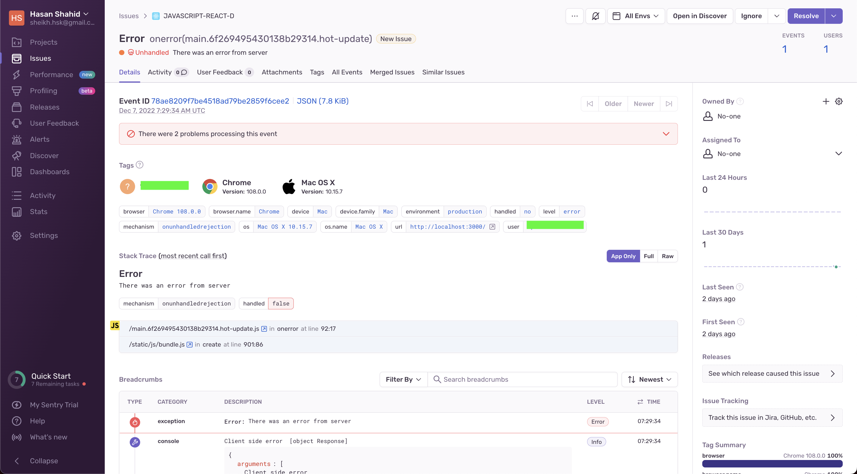
Notice how we have thrown an error under the on error event. If the connection is broken or if there is any error from the connection. And sentry maintains a list of errors that occur in our application with the specific details as well.
Once we have our custom components for graphs ready, it is time to plug and play with them. Under the screens directory add a new screen SSE.tsx In the return statement let’s add some code.
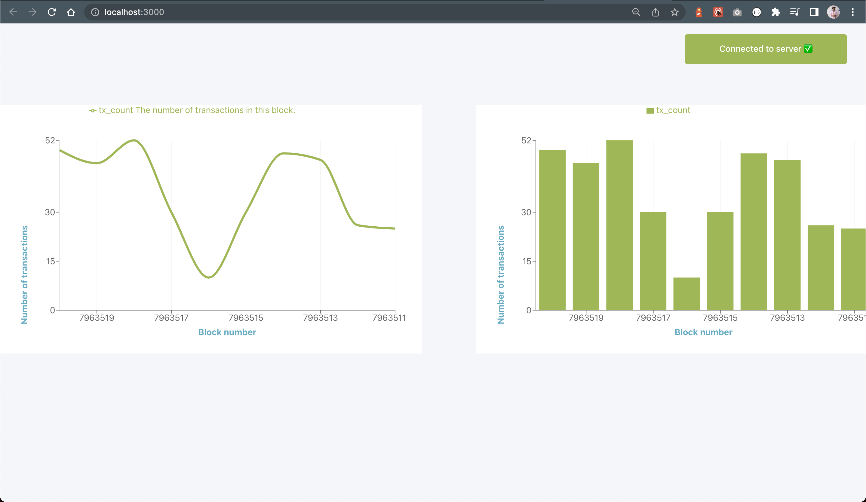
return (
  <>
    <CustomConnectionStatus connectionStatus={connectionStatus} />
    <div style={styles?.Container}>
      <CustomLineChart
        chartHeight={400}
        chartWidth={400}
        data={sseData}
        lines={[
          {
            name: "tx_count The number of transactions in this block.",
            dataKey: "tx_count",
          },
        ]}
        xLabel={{
          value: "Block number",
          position: "bottom",
          fill: "#4cadc5",
          fontWeight: "bold",
        }};
        yLabel={{
          value: "Number of transactions",
          position: "left",
          angle: -90,
          fill: "#4cadc5",
          fontWeight: "bold",
        }}
        xLabelKey={"block_no"}
        yLabelKey={"tx_count"}
      />

      <CustomBarChart
        chartHeight={400}
        chartWidth={400}
        data={sseData}
        bars={["tx_count"]}
        xLabel={{
          value: "Block number",
          position: "bottom",
          fill: "#4cadc5",
          fontWeight: "bold",
        }}
        yLabel={{
          value: "Number of transactions",
          position: "left",
          angle: -90,
          fill: "#4cadc5",
          fontWeight: "bold",
        }}
        xLabelKey={"block_no"}
        yLabelKey={"tx_count"}
      />
    </div>
  </>
);
import { fetchEventSource } from "@microsoft/fetch-event-source";
import React, { useEffect, useState } from "react";
import CustomBarChart from "../../shared/CustomBarChart";
import CustomConnectionStatus from "../../shared/CustomConnectionStatus";
import CustomLineChart from "../../shared/CustomLineChart";
import { styles } from "./styles";

/**
 * @type {React.FC<Props>}
 * @returns {React.ReactElement}
 */
function SSE(): React.ReactElement {
  const [sseData, setSSEData] = useState<any>();
  const [connectionStatus, setConnectionStatus] = useState(false);

  <<use-effect>>
  <<return-statement>>
}

export default SSE;
Conclusion 😮💨 #
Now to consume our SSE component in App.tsx.
import React from "react";
import "./App.css";
import SSE from "./components/screens/SSE";

function App() {
  return (
    <div className="App">
      <SSE />
    </div>
  );
}

export default App;
Run in DEV Environment 🏃🏽♂️ #
To run this code in your local environment in the dev environment, clone the application and then:
cd streamcardano
npm install
npm start
and then view the application at localhost:3000. Add your API key in .env to study responses.
Connected to Server ✅ #
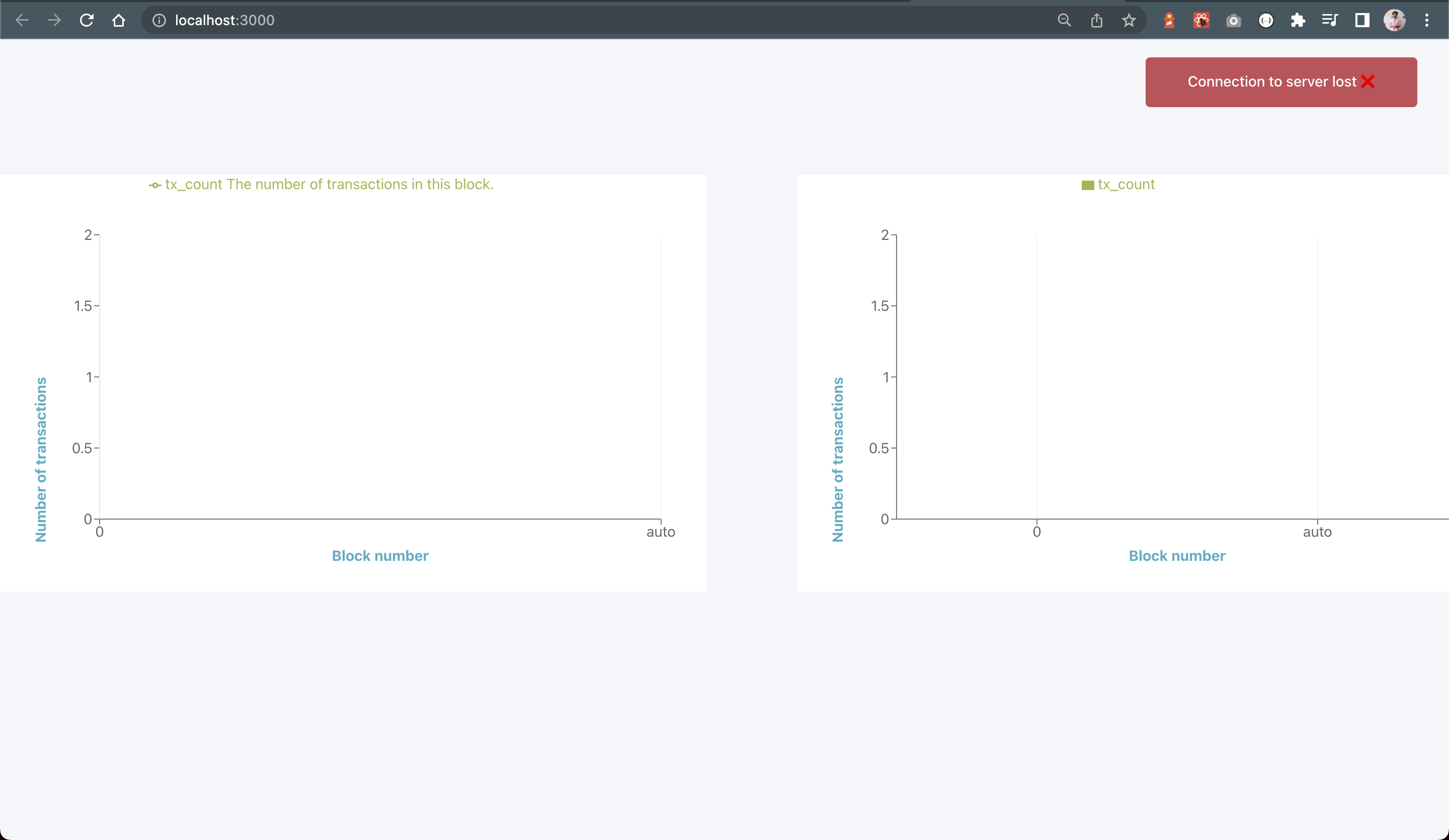
Connection Lost to Server ❌ #
Build & Deploy 🏗 #
You can also build this application with the following command. Then drag and drop the build folder to AWS S3 to deploy your web application.
npm run build
Also See 👀 #
🚀 Calling Stream Cardano from Haskell
🚀 Streaming Events of StreamCardano API Primer in Haskell
Libraries and Packages Used 📦 #
📦 Fetch Server Sent Events by Microsoft
📦 Https client to make server requests
📦 Recharts for graph and plotting
📦 Sentry tracking for error and crash tracking
Literate Programming Using Entangled #
Entangled helps you write Literate Programs in Markdown. You put all your code inside Markdown code blocks. Entangled automatically extracts the code and writes it to more traditional source files. You can then edit these generated files, and the changes are fed back to the Markdown.
FYI, This README just tangled you. 😁